Typefaces for technology and web design play a crucial role in today’s digital era, where every company needs an online presence. The best way to grow your brand online is through a website. But will having a website be sufficient to grow your brand? Not quite.
You must maintain many points of focus while building a website. A flawless website consists of a number of components, from immaculate content to impeccable visuals. The website font is one such important element that determines how your page looks overall.
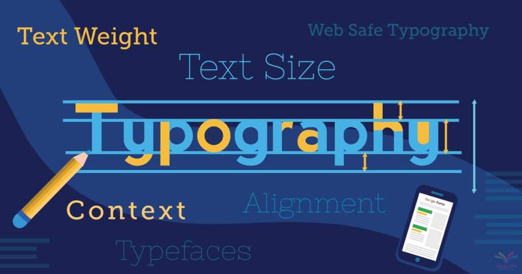
Fonts, also referred to as typography, affect how visitors view your website and how they read. They support website content communication and accentuate the voice of the brand. The font families you use on your website give readers information while also enhancing the screen’s clarity and sharpness.
Website Fonts and Regular Fonts
Regular desktop fonts are not the same as fonts used on websites. Regular fonts are installable and used in desktop applications like Microsoft Word and Photoshop. Website fonts, on the other hand, are the only ones utilized for designing websites. Website fonts cannot be used for printing because they are designed to be read on a screen.
TrueType, EOT, WOFF, and SVG files are the four different types of online font files. Each of them is made to display the chosen font on various browsers. To ensure that your website’s font is displayed as intended across all browsers, your VPS Server must have all four of these file types.
Web-Safe Typefaces for Technology and Web Design
The common font types seen on most PCs are called “web-safe” fonts. Early websites typically utilized these typefaces. The number of font possibilities was limited in the early years of web design. Web-safe fonts are therefore readily available and accurately displayed on all browsers. Some of their examples include Arial, Times New Roman, Georgia, and Brush Script.
Google fonts are widely used nowadays as web-safe fonts. Google owns the well-known web font service known as Google Fonts. Free and open-source fonts, APIs for using Google fonts with Android and CSS, and an interactive web directory are all features of this web font family.
Benefits of Using Fonts
As was already stated, when building a website, the design, and presentation of your text are essential. It draws in potential customers and creates a strong sense of brand identification. One of the key elements that contribute to the text’s appealing framing is font style.
Below, we’ve grouped together a few reasons why it’s crucial to start focusing on font:
Communication method
Certainly, an image can convey a message and aid customers in understanding your website and offerings. So is it possible to ignore the words entirely? Obviously not.
If a website has an understandable font type, visitors can learn everything there is to know about the items or services. Readers can understand the message without being distracted by a good font style.
For instance, the comic sans font conveys lighthearted messaging; picture putting it on a business website! So, it is crucial to pay close attention to the font that is being used.
Ensures coordination and harmony
Webpage content is not added at random. Instead, they arrange everything in a logical order to facilitate understanding. Yet employing various typefaces is crucial for readers to comprehend and relate to it. It aids readers in navigating a text by drawing attention to its important parts.
Also, a decent font style contributes to the overall harmony of the website. Visitors would be able to tell what each page is about as they navigated from one to the next.
Directly impacts the expansion of businesses
The readers of your website will stay informed if you use a nice font style. One important criterion for business growth, the total user experience, is impacted. Visitors will stop visiting a website even if it has quality content if the typeface is difficult to read.
Hence, having readable and tidy typefaces on websites becomes essential. Sharp fonts not only enhance traffic but also multiply opportunities and earnings. Good feelings would be evoked, thus contributing to the expansion of the company.
Strengthens the brand’s identity
The use of the right fonts aids in creating a strong brand image while also assisting readers in understanding the website’s purpose. Sometimes a website’s services and offerings are rapidly forgotten by visitors since they do not have a lasting impression. A fantastic font design, on the other hand, helps them remember the website and creates a lasting impression of the specific brand.
A clear font is crucial for building a strong brand presence because of this. It offers a fantastic user experience and establishes the general tone of the company.
Various Website Font Types and Categories
There are several available typefaces for websites, both free and premium. To focus their approach, the thousands of typeface variations are divided into several kinds. Sans Serif, Serif, Script, and Cursive fonts are the four main types or divisions of website fonts. The sans-serif font is the most widely used of all.
Serifless Fonts
One of the greatest fonts for website design that denotes solidity, modernity, and style is sans serif. The font frequently lacks any additional serif lines and has a neutral appearance. Every site design may use the Sans Serif typeface, making it the ideal option for designers.
The readability and user experience provided by the web-safe typeface are superb. The typeface looks tidy and understated in both the webpage’s header and body text. Arial, Open Sans, Calibri, Helvetica, and Verdana are some of the most well-known Sans Serif font samples. The cutting-edge design of the Sans Serif font makes it versatile in placement and use if you want to give your website an approachable or pleasant vibe.
Script fonts
Serif font is a conventional, elegant font that is well-readable for websites. The top and bottom of each character have extra strokes in the web-safe typeface. Readers can more easily browse written content because of the consistent and predictable structure of Serif fonts used in body text and header text on websites.
Serif fonts are a popular choice among brands because they are eye-catching and draw more website visitors, giving them a higher reputation than competing brands. Times New Roman, Cambria, and Garamond are a few examples of well-known Serif fonts.
Font in script
The appearance of script font is intended to resemble calligraphy and conventional handwriting. Depending on the font style, this typeface’s flexible strokes can be fully connected, partially connected, or unconnected. Of all the others, it is regarded as the greatest typeface for websites.
This font type mimics the irregularities of natural ink by creating a continuous flow from letter to letter that gives the appearance of texture. Formal and informal script typefaces are both available. The informal is used by designers for more laid-back design tasks, while the formal invokes the master handwriting.
Cursive Typefaces
The distinctive font style known as cursive was created to resemble hand-drawn writing. It has letters that are connected and looped together fluidly to speed up writing. The typeface provides any website design with a calligraphic flair and adds beauty. Taglines, blog post titles, and headers on your website look fantastic in cursive font.
Website fonts that work best
Now that you are aware of what each category comprises, the following are some noteworthy favorites and the top online fonts:
typefaces without serifs
Open Sans
Open Sans is the font to choose if you want a traditional typeface that can deliver a clear, straightforward, yet contemporary message. The Sans Serif font is very well-liked among web designers. It is one of the most often used Sans Serif fonts for small screens because of its sophisticated and attractive look, which provides an excellent reading experience.
Open Sans is a free, open-source font created by Ascender Corp. director Steve Matteson that works well across many platforms. On well-known user interfaces, Open Sans Serif frequently serves as the default typeface. Open Sans contains a variety of fonts, such as bold, italic, semibold, extra-bold, etc.
Neo-grotesque typeface
Formerly known as Grotesque, this Sans Serif font was the first of its kind. Because of its clumsy and erratic style, it was given a special moniker when it first appeared in the 19th century. Its general aesthetic changed by the middle of the 20th century, leading to the renaming of the movement as Neo-Grotesque.
This modern typeface is well-known for its relaxed warmth and works best with landing pages. Neo-Grotesque will work best for your website if you want to give it a vintage appearance.
Typeface Leaner
Websites can use the all-caps, minimalist Sans Serif typeface called Leaner. It offers a more distinct visual impression and blends in well with most websites. This multi-weight typeface employs unusual patterns and asymmetrical angles to boldly display each letter and number.
Baskerville
The transitional Serif font family includes the John Baskerville design from the 1700s. Websites that deal with e-books and other reading information should use it because of its sharp form and great contrast. This typeface is visually appealing due to the classic accent, which is important to keep visitors.
Serif fonts.
Times New Roman
For ages, Times New Roman has been among the most widely used types. Its European and contemporary inspirations aid in producing attractive websites. There are about 12 styles underneath this serif font that are suitable for headers. Times New Roman, one of the best fonts for websites, is almost always used as the default font in writing interfaces.
Argesta
Argesta is a great option if you require a beautiful and current font for your website. The combination of its modern design and retro touches creates a font that looks good. Argesta crafts a well-balanced design using everything on the website, from corporate logos to other information.
Cambria
Of other Serif fonts, Cambria is said to be the most popular. Because each stroke’s endpoints are highlighted by horizontal Serifs, this font type is very readable. Even when presented with modest font sizes, Cambria provides readers with an excellent on-screen experience. It offers a consistent proportion and adapts well to any website text.
Lora
The Lora font is a great option for a blogging website where readers spend a lot of time reading. Compared to Baskerville and Times New Roman, it is a little easier to read. As practically all websites perfectly display Lora’s current and contemporary graphics, one can use this typeface to experiment a lot. This font family comes in a wide range of styles, including bold, italic, regular, etc.
Crinkly typefaces
Precious
The strokes and accents used in the precious cursive font are exquisite. The website’s headlines and headers look great with their lovely spirals and swirls. Since its 1996 introduction by the font’s creator, Bolt Cutter, it has been one of the most widely used typefaces.
Agatha
Agatha is a common cursive writing typeface that heavily favors flourishes and scrolls. This typeface stands out from the others in its category thanks to its looping extensions. If you want to display any signatures on your website, the Agatha font is a perfect option.
Berrylicious
A beautiful cursive font with a hand-lettered brushstroke effect is Berrylicious. Its numerous variants in letter structure make it simple to design an attractive and highly readable website.
Script font
Auro Rumpthut
Auro Rumpthut by Khaiun is regarded as one of the top web cursive fonts. It employs a comprehensive collection of punctuation, numbers, and capital and lowercase characters. Swashes are used at the start and finish of the lowercase letters. The website seems smart and appropriate thanks to the attractive font that gives it a more authentic handwritten appearance.
Clattering font
A little aggressive brushstroke is used to produce the clattering font between thick and thin curves. One of the most adaptable and legible classic fonts, the handmade brush typeface gives off a surfer-chic vibe. The clattering font is ideal for use in branding initiatives, websites, product designs, watermarks, and social media postings. The clattering typeface is also perfect for tasks that call for a handwritten look. For personal use, the font is free; however, commercial use necessitates the purchase of a license.
Seaweed Dialogue
Squid’s Seaweed Script typeface is ideal for all of your whimsical designs and classy invitation artwork. The typeface includes a single regular design with wavy borders and True Type characteristics for an earthy, genuine appearance. Designers use high-quality font glyphs in significant projects for designing objectives. The Seaweed Script font is the perfect font for websites because of the characters’ organic flow.
Grade 5 cursive
The beautiful cursive font used in fifth grade is created to appear scribbled naturally. The elegant edges of the 5th Grade Cursive typeface lend the composition a casual grace. The font is free for both personal and professional use, demanding, clear, adaptable, and visually attractive. The fifth-grade cursive font is ideal for websites with a retro or vintage theme.
How Can I Pick the Best Fonts for My Website?
A website’s design takes a lot of effort and intelligence. An ideal website requires a lot of work, from selecting the right color palette to adding the right navigation and designing the optimal layout.
But out of everything, bringing everything together to create a condensed, well-balanced website is the one aspect that is the most challenging.
Your visitor will first scan your entire website before turning their attention to the text. It is at this point that website typefaces are useful. Your customers will be able to learn more about what your brand stands for with the aid of the information provided on the website.
You should therefore pay close attention to even the smallest aspect of your font design. If you use the right font family, your clients can read every word without becoming sidetracked.
We have put up a list of tips that you should consider to assist you in selecting the proper font for your website:
Start With the Foundations
Study the fundamentals of the typeface before choosing one. Designers typically like Sans and Sans Serif as their two main font family options. These typefaces have certain distinguishing qualities that enhance the aesthetic appeal of a website. Alternative fonts required for main text are Verdana, Playfair Display, etc.
Your target demographic and the tone you want to convey through your typeface will have a significant impact on the sort of font you select. Serif fonts lend a formal and elegant tone to the website, whilst sans fonts contribute to a more simplistic and minimalistic appearance.
A superb website must also be well-aligned and have excellent color contrast. Because of this, consider these factors when selecting typefaces for websites.
Your website’s goals should be reflected in its font choice
For developing your website, there is a tonne of font alternatives available online. This may sound fantastic, but the endless options can make things too difficult if you are unsure of how your website should look. So, it becomes crucial to consider your website’s objective before selecting a typeface that will effectively communicate your message to website visitors.
Choose a limited amount of fonts
You can’t just rely on one font style when creating a website. Your major text and secondary text should have slightly contrasting visual styles. Consequently, it is advised to use a variety of font styles.
For the primary text, pick fonts that complement your brand’s identity and have more impact. You should use an easy-to-read font style for your secondary text or paragraphs, such as Roboto or Verdana. A website should only employ different fonts and important font types in this specific order, depending on the needs and specifications of the text.
Pro tips: Use no more than three font types; otherwise, it will be difficult to synchronize them.
Be mindful of the loading time
Nobody enjoys browsing a website that takes a long time to load. You should therefore be careful in selecting your font styles. Some things to remember are as follows:
Choose just a handful of typefaces: A large number of fonts will increase loading time. To ensure that the website loading performance is unaffected, it is preferable to stick with just two or three typefaces.
Choose looks that perfectly reflect your brand: Choose the required font styles. Most of the time, individuals simply use bold and standard designs because they are simple to put into any website.
Try varying the fonts’ pairings.
One thing to keep in mind about font styles is that each one has a unique quality. Some fonts have a harsh style, while others have a humorous touch. Combine two and three font types to make your website more aesthetically beautiful.
The most often used font varieties, sans and sans serif, are also available. For a more upbeat website, these two fonts contribute to a distinctive yet appealing style.
Picking typefaces from the same family may help if you are still unsure about which two styles to choose. You can achieve consistency in their overall design by doing this. To produce a contrast, you can alter the casing, weight, and size.
many web font styles
Conclusion
There are many creative and attractive font style possibilities available on the web. However, it can be difficult to select one of the best fonts for websites.
Your website might become more attractive and visible by using a carefully selected typeface. On the other side, visitors may be misled by a dull or unprofessional typeface, which will directly affect the bounce rate of your website. As a result, care should be taken to consider every small element while selecting typefaces for websites. Even if selecting a typeface is important, there are still inventive ways to apply it.
Web-safe fonts are used by website designers, which the browser downloads and then applies to the text. These fonts typically come in a variety of options and are accessible via the web via a VPS server, enabling businesses create distinctive identities.
You have a wide range of possibilities thanks to the list above. A website that is easy to read has a bigger effect. For more insights and the latest updates, visit ServerGigabit’s blog